Showing posts with label Charts. Show all posts
Showing posts with label Charts. Show all posts
Chore Chart for Kids


Reward Chart Templates
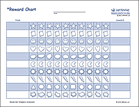 Download a few different types of Reward Charts for your kids, including a simple reward chart as shown in the image, a practice chart, school behavior chart, and a weekly reward chart for multiple kids.
Free Family Tree Template
 This new family tree template contains multiple designs and layouts for creating horizontal family tree pedigree charts. The thumbnail to the left shows a portrait layout of the more colorful chart. There are also blank printable PDF versions that you can complete by hand, or share as class handouts.
Golf Score Log
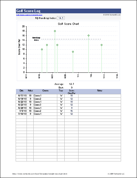 This Golf Score Log spreadsheet lets you track your golf scores, but the really cool thing is how it lets you filter by Course, # of Holes, etc. It displays your Handicap Index, and if you filter by Course, it will display your Course Handicap. I hope this is useful, but if not, it was at least fun to create. :-)
Blood Pressure Chart & Log
 This Blood Pressure Chart spreadsheet helps you track your SBP and DBP blood pressure readings over time. You can use the printable blood pressure log to track by hand and/or use the spreadsheet to create a visual chart that may help you identify trends.
Blood Sugar Chart
 This new Blood Sugar Chart and printable blood sugar log can help you track your blood sugar levels over time. The worksheet also includes a chart for tracking your Hemoglobin A1c levels.
Critical Path Method and PERT
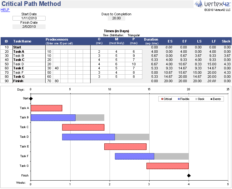 This Critical Path Method spreadsheet implements the PERT algorithm for analyzing the durations and dependencies of project tasks. This is a handy tool for project management.
Fishbone Diagram Template
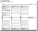 This Fishbone Diagram, also known as a Cause and Effect Diagram or Ishikawa Diagram, was designed for ease of use. So, even though it isn't angled like most fishbone diagrams, it is much easier to edit than one that uses textboxes and arrows.
PICK Chart for Lean Six Sigma

This page explains how to use a PICK Chart in a Lean Six Sigma event to help categorize process improvement ideas. You can also download a free template for recording the ideas.

Control Charts

This new Control Chart template creates X-bar, R, and S charts. Just add your data to the data table. It also calculates process capability indices (like Cp, Cpk) and percent yield, based on given specification limits.
Organizational Chart Template
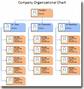 See examples of different types of Organizational Charts for companies, corporations, nonprofit organizations, and schools. Download an Organizational Chart Template for Excel 2007.
Pareto Chart
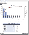 This new Pareto Chart Template helps you perform a quick pareto analysis without having to manually create the chart. Creating your own can be time consuming and tricky if you don't know how to work with a secondary axis. This pareto chart template highlights the most significant items and the placement of the labels makes it possible to have descriptive labels without messing up the size of the chart.
BMI Chart Template
 This BMI Chart was created in Excel using similar techniques as the Ideal Weight Chart. The spreadsheet also includes a BMI Calculator.
Weight Loss Chart Template

To go along with my recent Exercise and Fitness theme, I've created a new weight loss chart template for Excel, as well as a few printable weight loss logs and charts in PDF format that you can download, print, and keep handy right next to your scale (at least that's what I'm doing). I've got more Exercise Charts coming ... stay tuned.
Ideal Weight Chart
 I've added a new spreadsheet that includes a table, chart, and calculator for estimating your ideal weight. The Ideal Weight Chart uses the BMI, Devine, Robinson, and Miller formulas - all on the same graph - so it is fairly easy to compare them.
The chart uses a special trick for creating the shading that highlights the overweight, normal, and underweight regions based on the BMI (body mass index). The shaded regions are created using a stacked area chart, but because I wanted the gridlines on TOP of the areas, I made two different charts, superimposed over each other, with the area chart on the bottom. The top graph has the backgrounds turned off so that the colors from the area chart show through. (This technique was also described in a comment on this site). I don't really like having to use this approach, but other than creating a bunch of dummy series to use as the gridlines, I don't know of another approach.
Update (2/12/09): Excel Charts expert and MVP Jon Peltier gave me a great suggestion - to make the gridlines using error bars with a dummy series. Now why didn't I think of that?
Update (2/13/09): Created a BMI Chart using the same chart techniques as for the ideal weight charts.
Simple Gantt Chart Spreadsheet
 This spreadsheet uses conditional formatting to create a Gantt chart in Excel. The inputs for the tasks or milestones are the start date, the duration (in calendar years), and the percent complete. It can be used for quickly creating project timelines and schedules. Just right if you don't quite need the complexity of Microsoft Project.
Free Simple Amortization Chart Template

Create a basic amortization chart that compares the cumulative interest vs. principal for a fixed-rate loan. Good for gaining an initial understanding of amortization for car loans and home mortgage loans.
Subscribe to:
Posts (Atom)